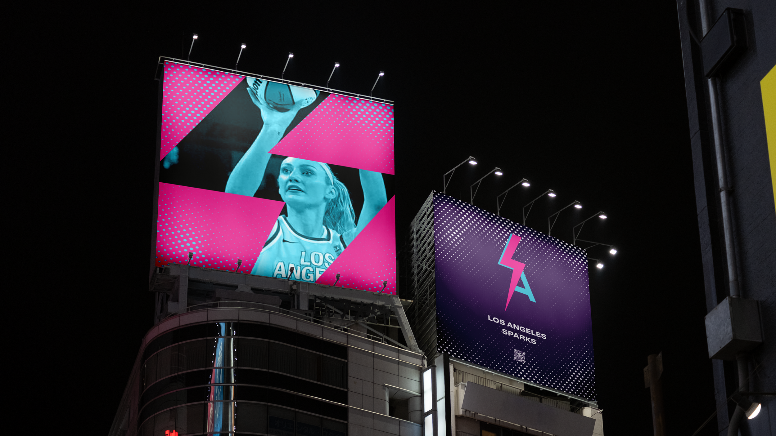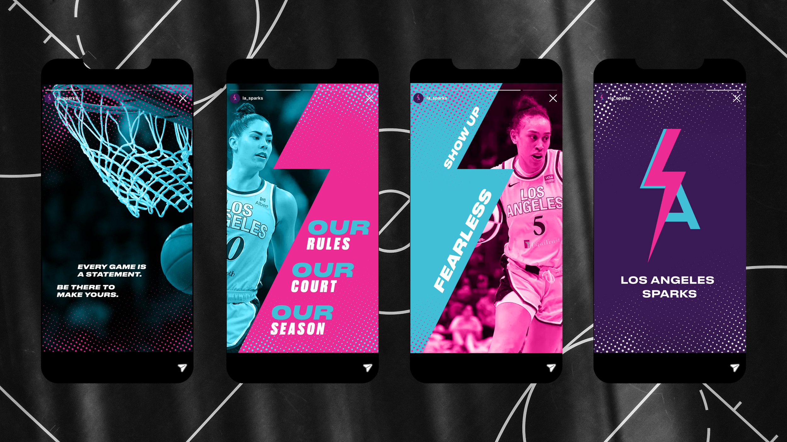
LA SPARKS
Sports Rebrand
BRIEF
Simulated client project, Shillington School of Design
ROLE
Sole designer, end-to-end
DELIVERABLES
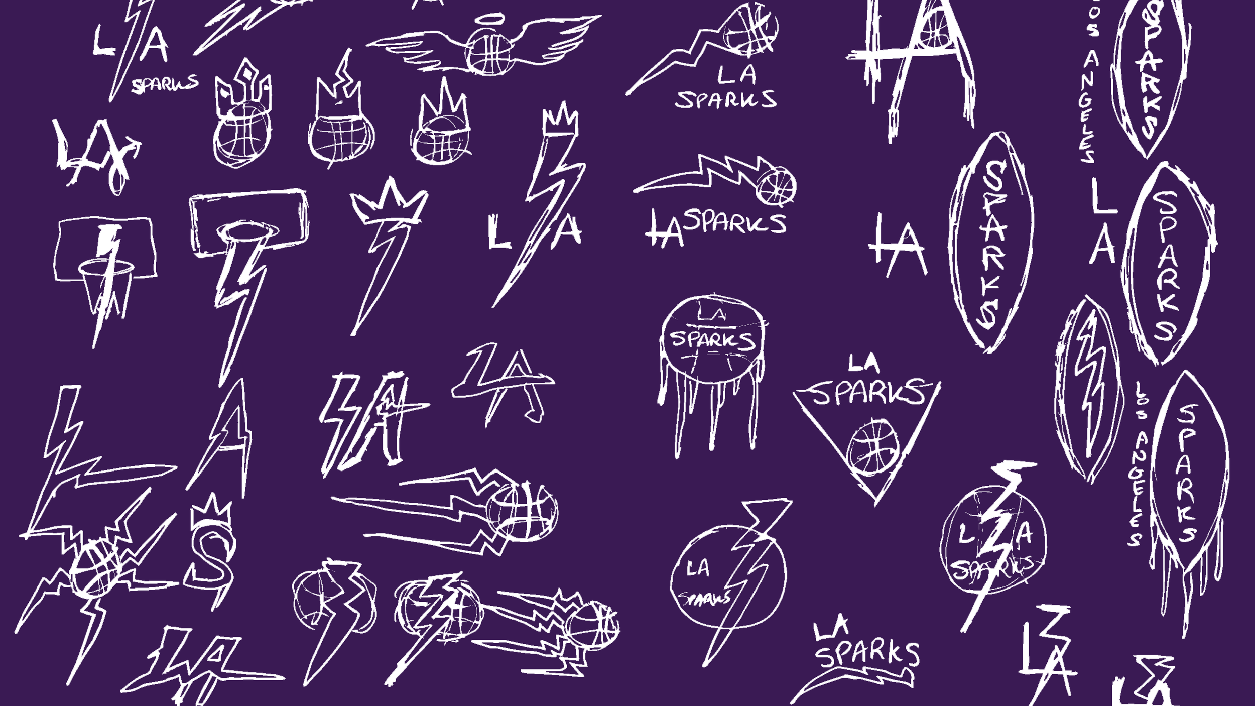
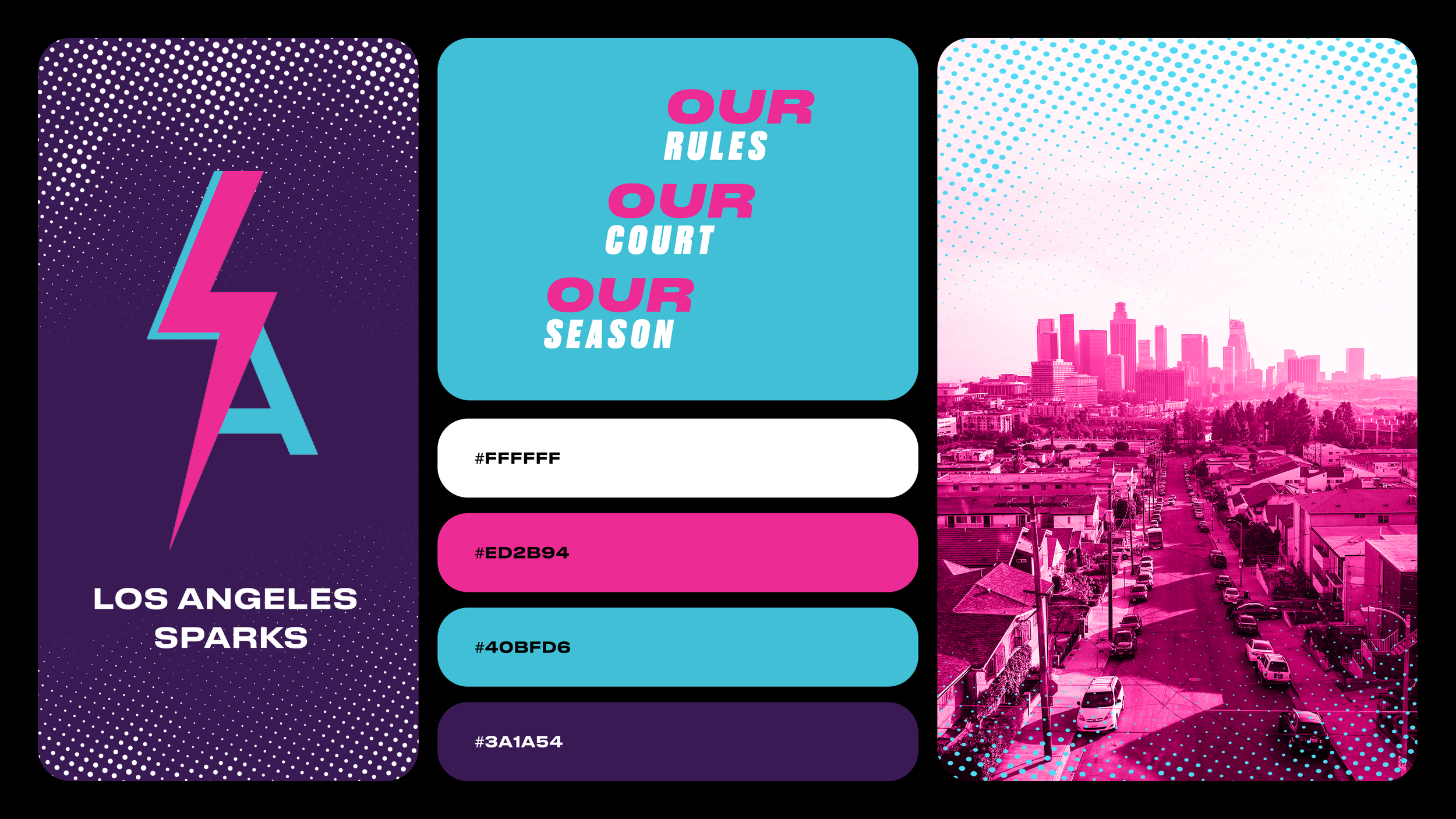
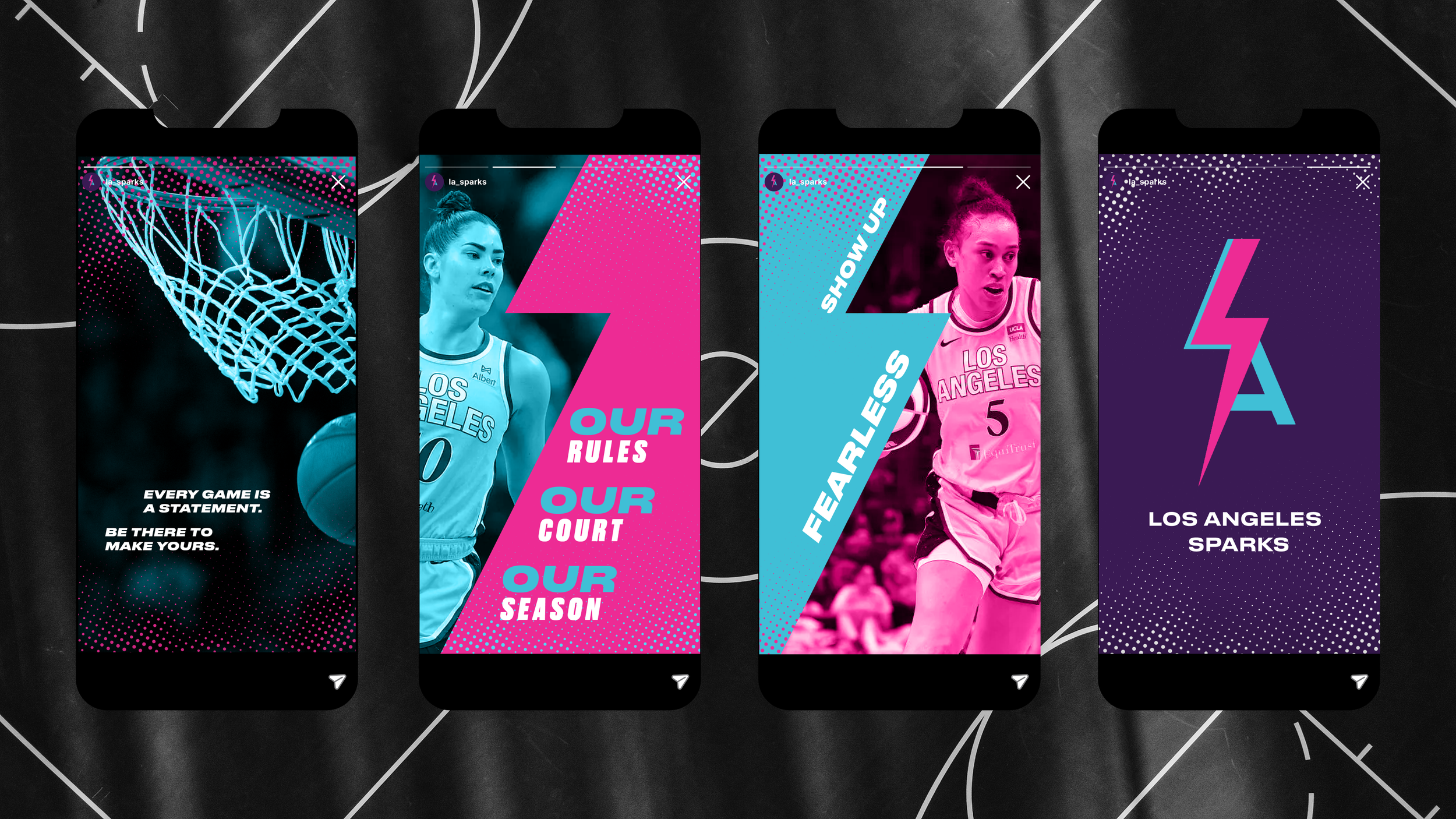
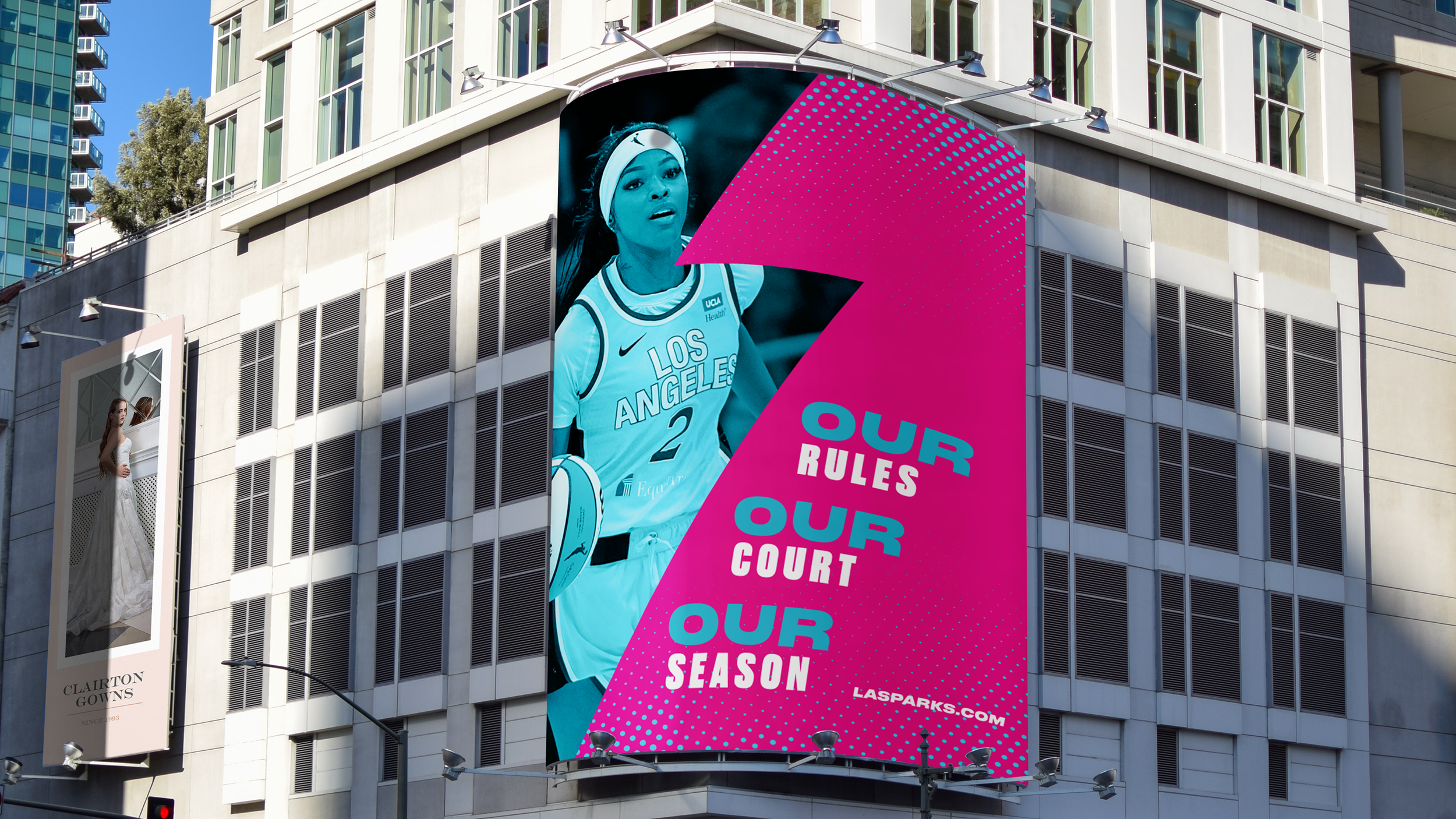
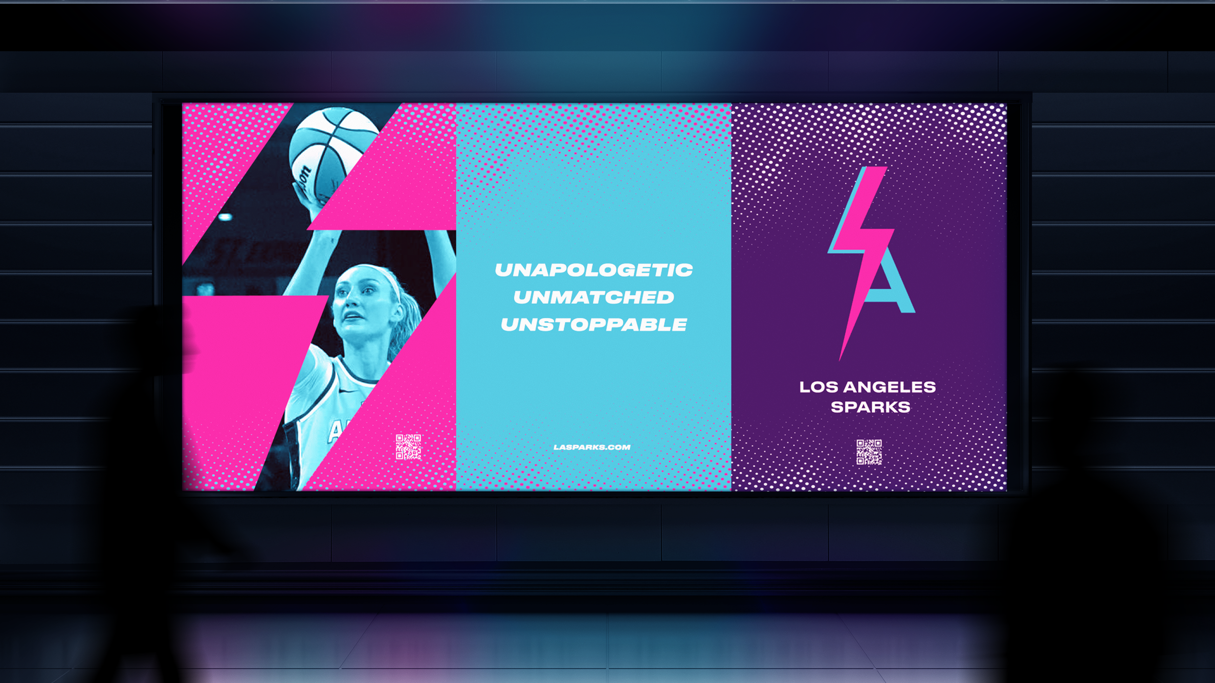
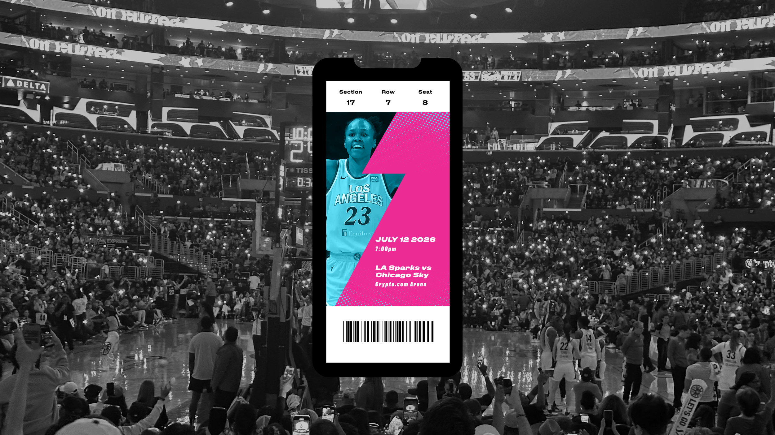
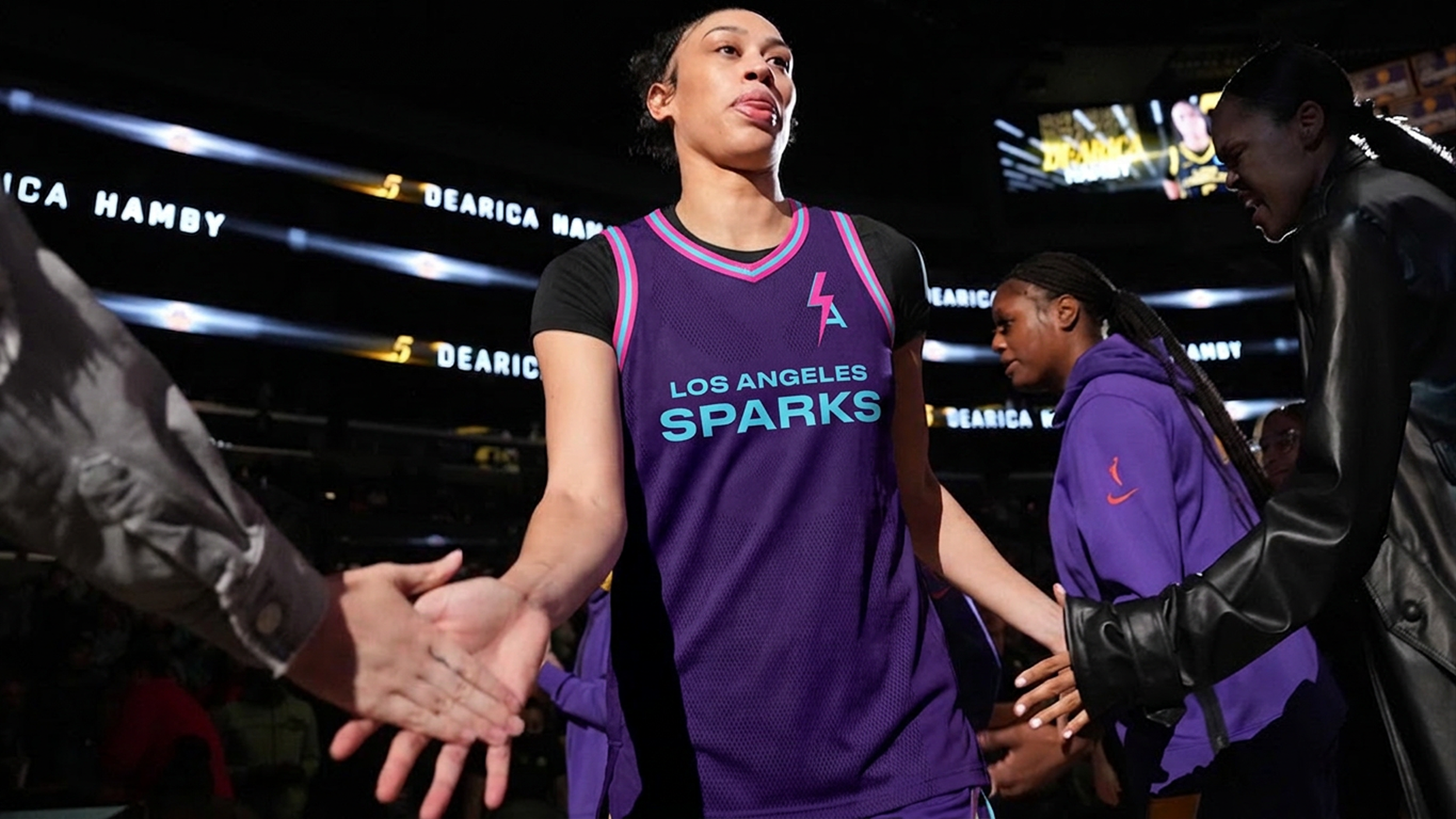
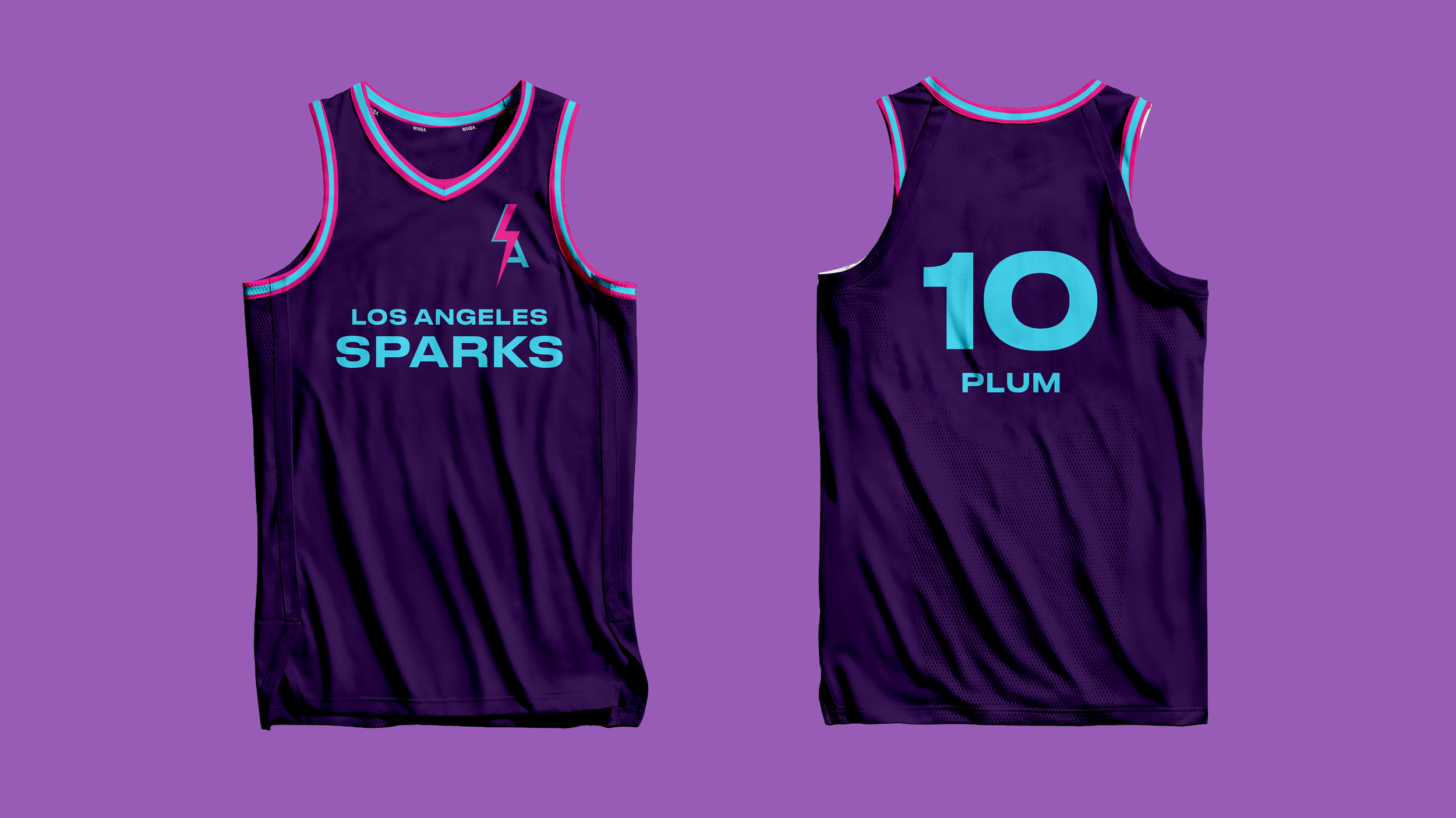
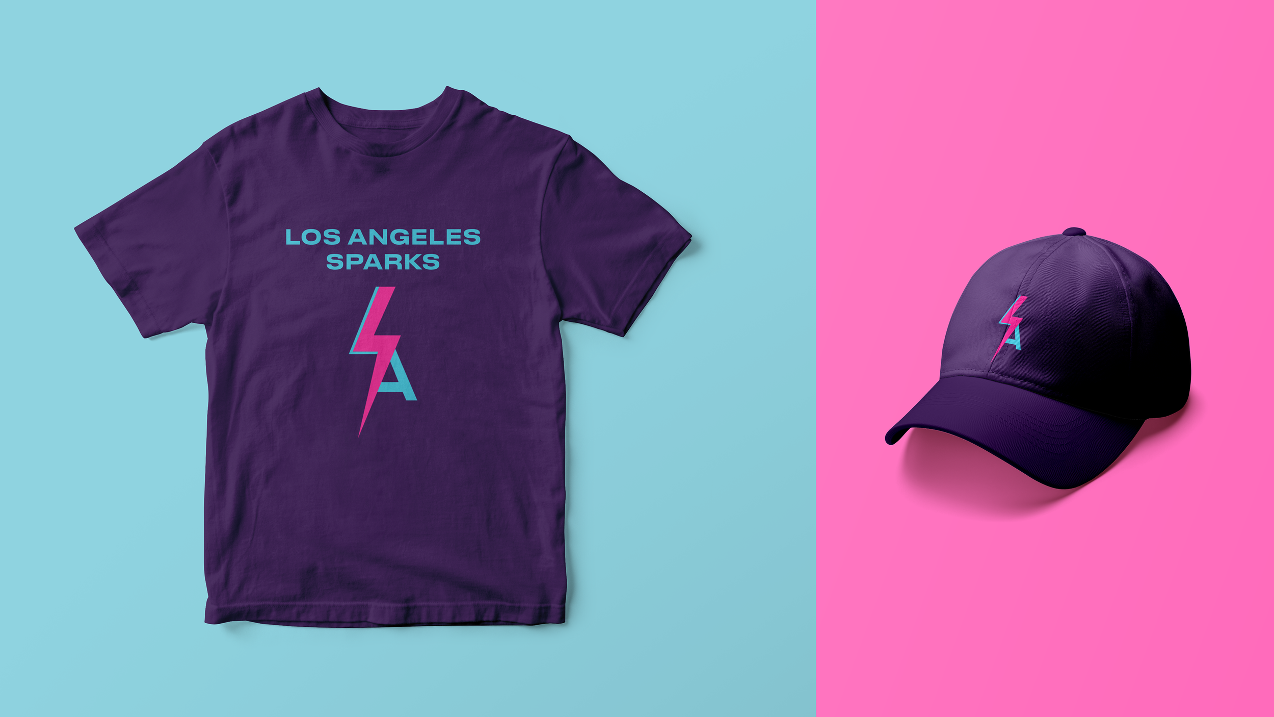
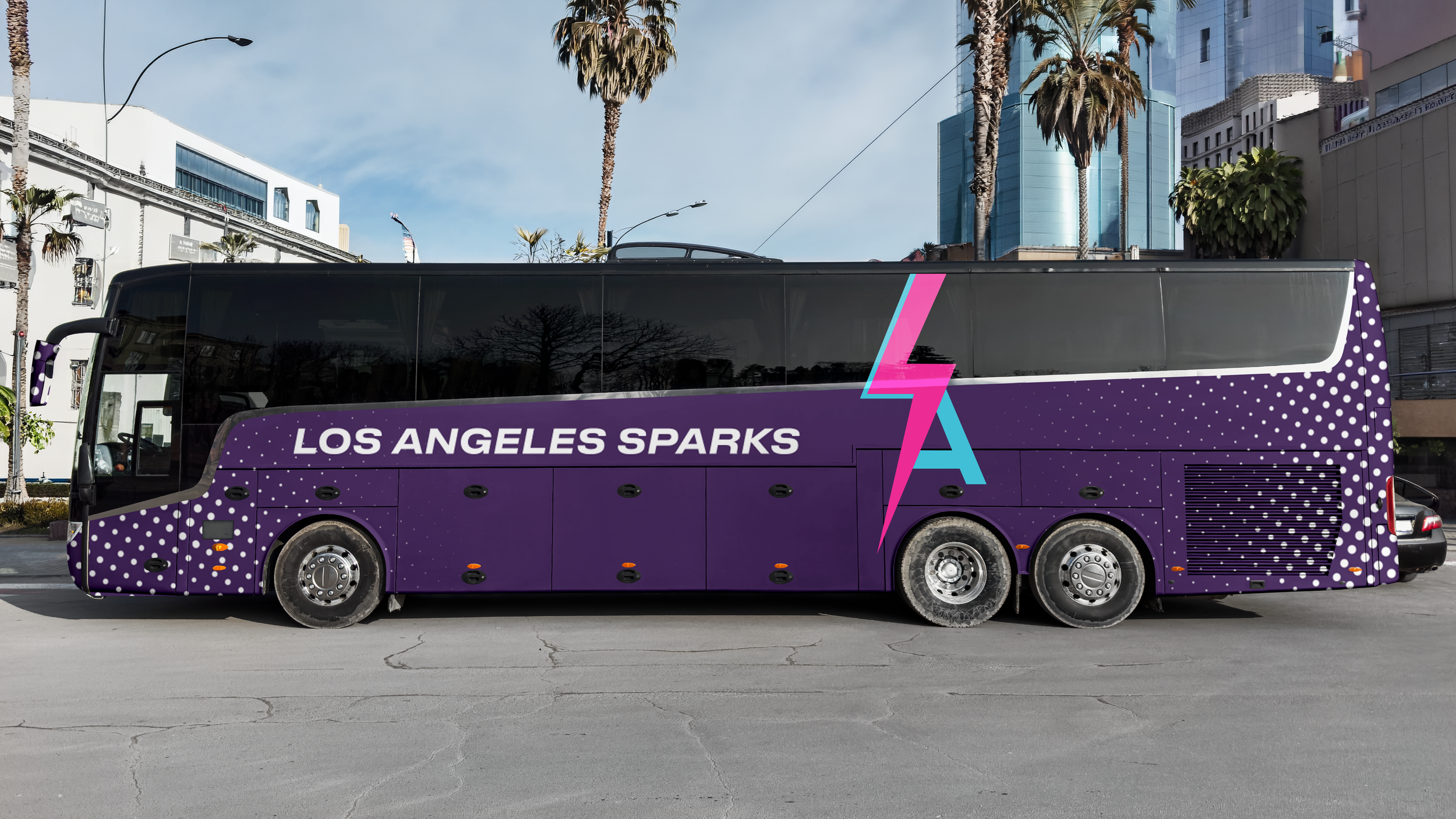
Logo, visual identity system, uniforms & apparel, social media campaign, poster series, digital ticket
CONCEPT
Our Game. Our Way.
BRAND VALUES
Inclusivity, resilience, empowerment
OBJECTIVE
Develop an independent visual identity that positions the LA Sparks as a bold, iconic franchise while inspiring the next generation of WNBA fans.
CHALLENGE
The LA Sparks' existing identity closely echoed the Lakers, making the team feel like an extension of that organization rather than a brand of its own. This made it difficult to reach the audience the WNBA needed most — young girls and women looking for a team built for them, not living in another team's shadow. The challenge was to create an inclusive, bold, and original identity that could inspire current fans while encouraging young girls and women to become lifelong supporters of both the team and the WNBA.
SOLUTION
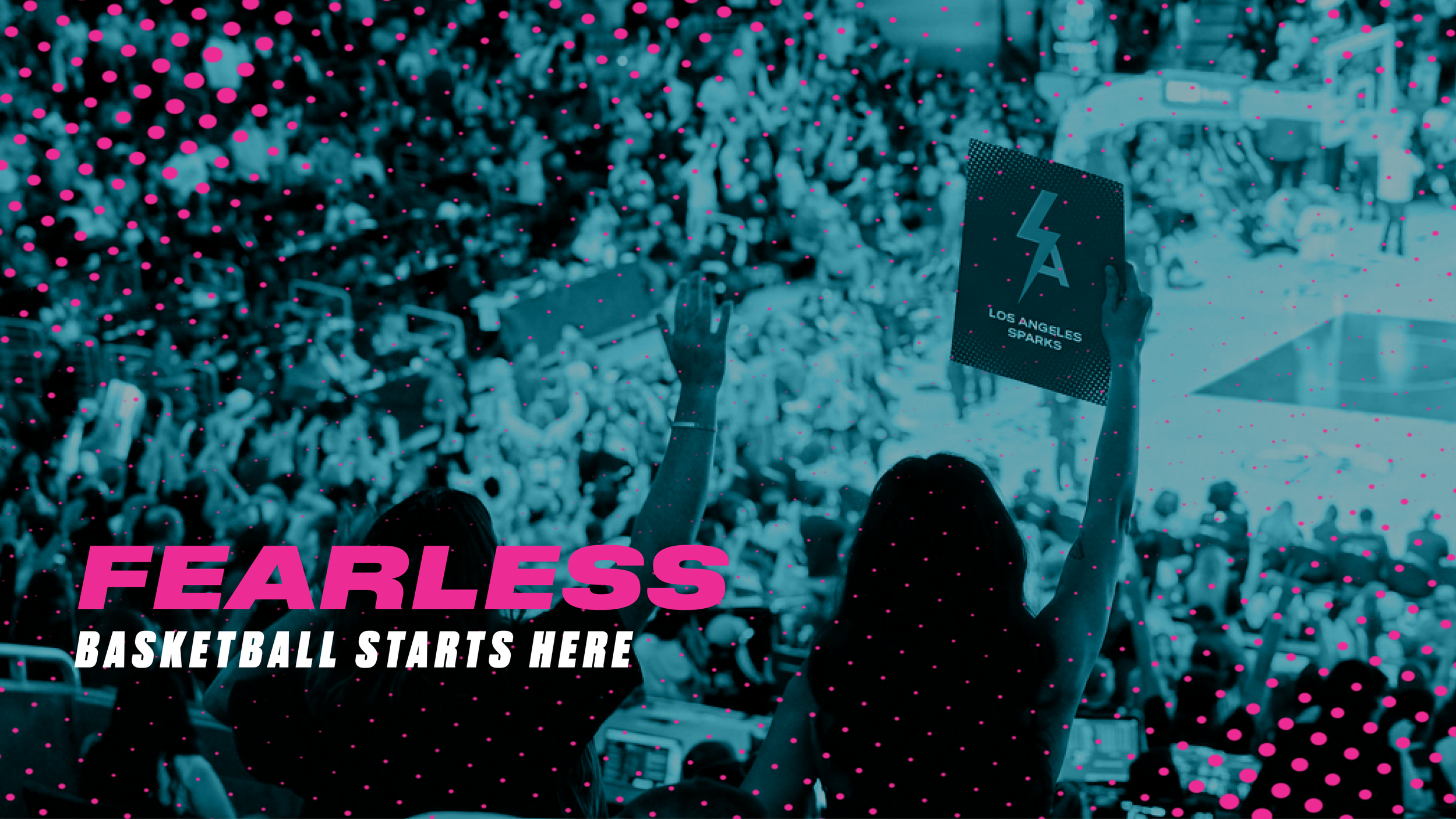
I answered that challenge with the concept "Our Game. Our Way." — positioning the Sparks as athletes who define the game on their own terms rather than waiting for approval. I completely broke away from the Lakers' visual language, developing a new logo, color palette, and visual identity system before extending it across uniforms, apparel, posters, ticketing, and social media. The result is a fearless, inclusive brand built for women, by women, creating a visual system that feels vivid, bold, and unapologetically fierce.