MUTINY
Packaging & Brand Identity
BRIEF
Simulated client project, Shillington School of Design
ROLE
Sole designer, end-to-end
DELIVERABLES
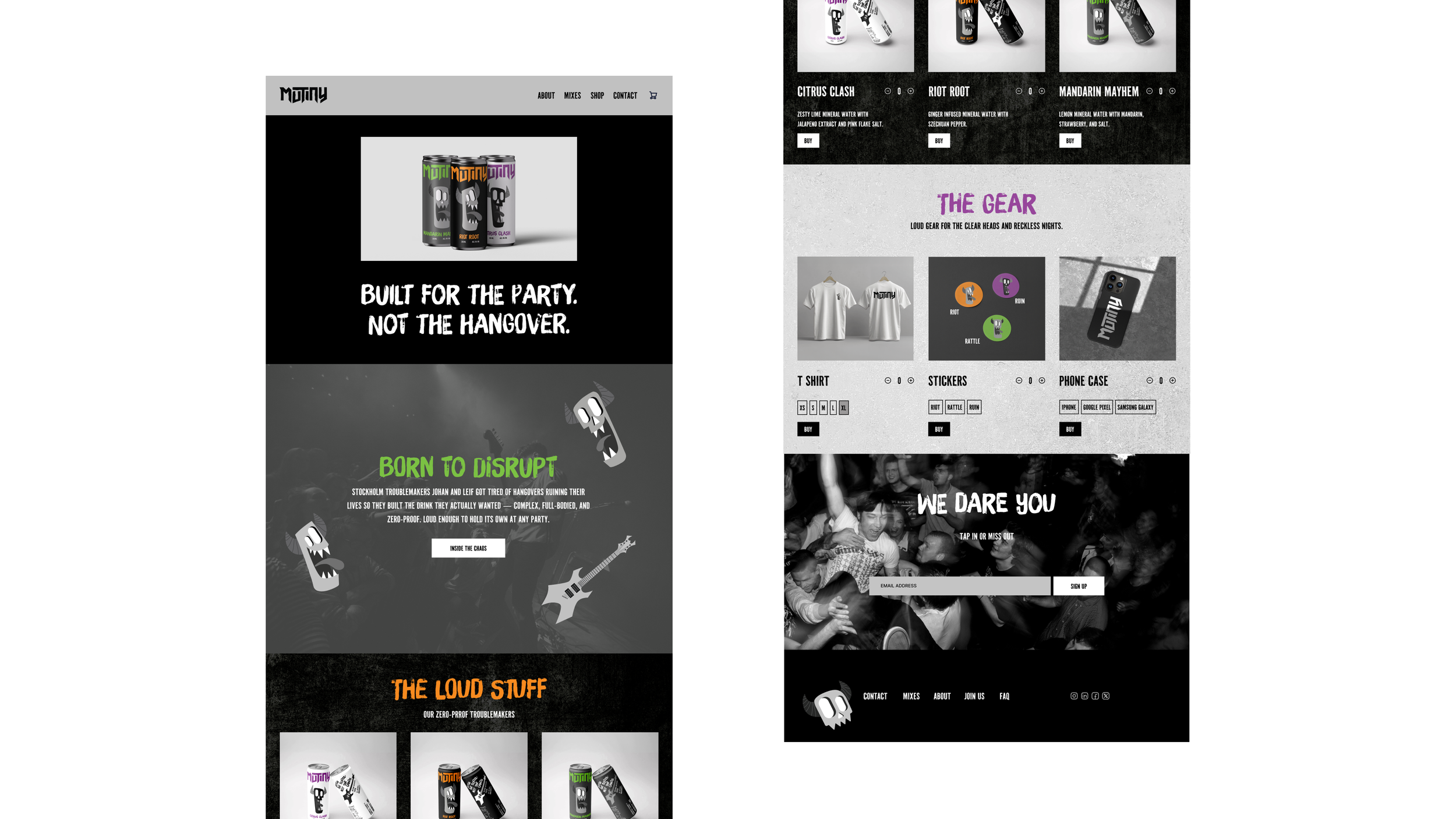
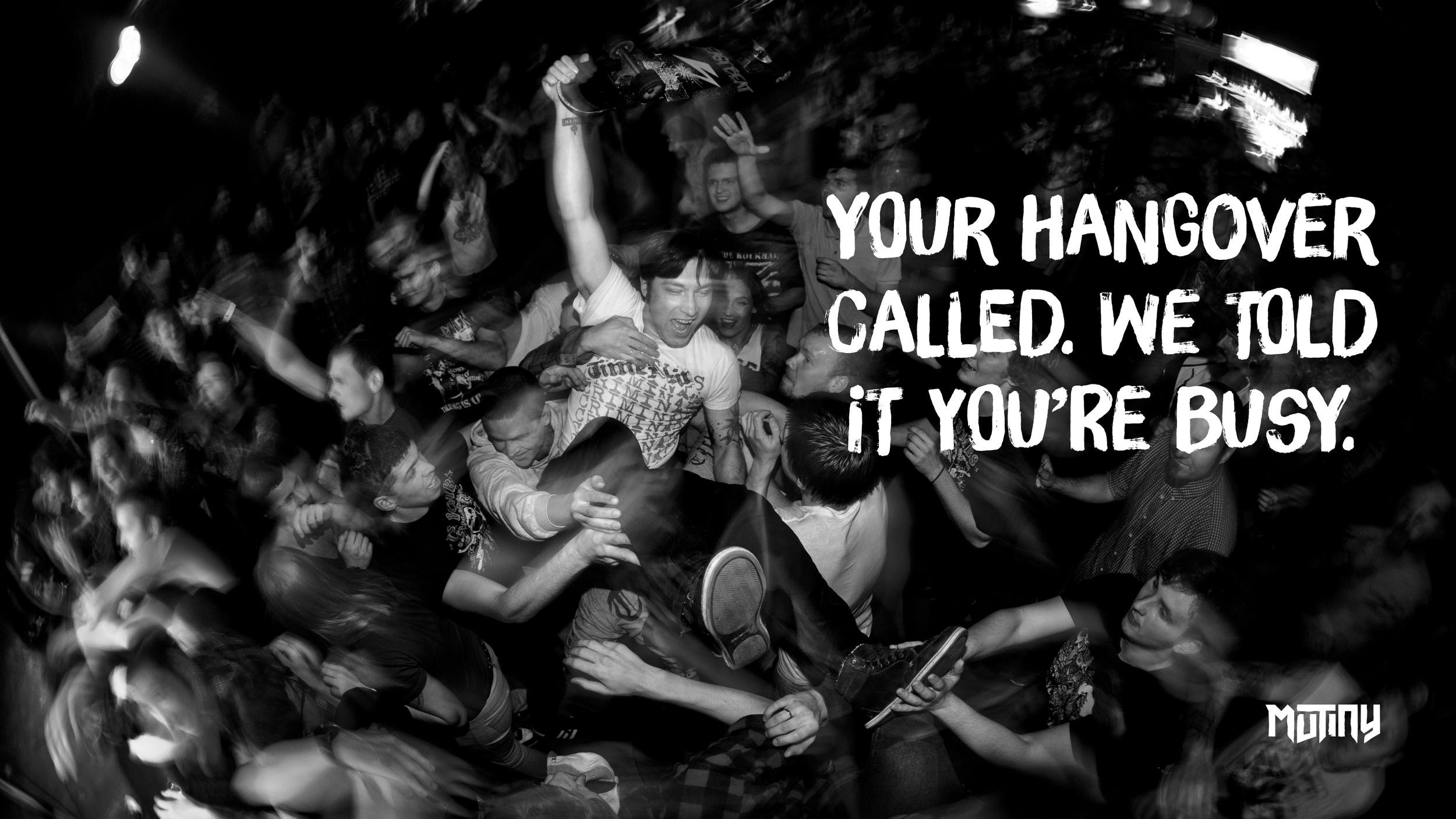
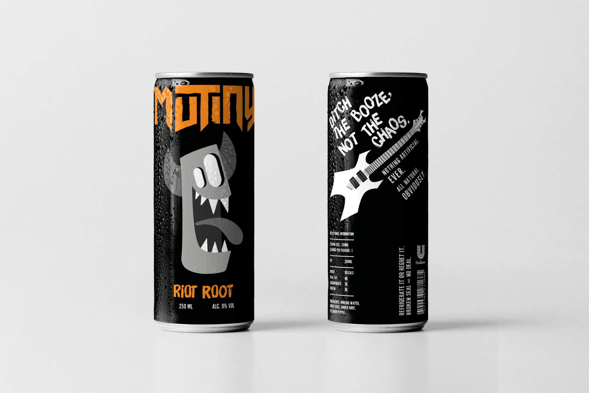
Logo, visual identity, packaging system, website design, posters, merchandise
CONCEPT
Measured Taste, Electric Finish
BRAND VALUES
Nostalgic, offbeat, playful
OBJECTIVE
Create a zero-proof beverage brand loud enough to keep its drinkers in the middle of the fun while feeling just as bold and culturally relevant as its alcoholic competitors.
CHALLENGE
Two Stockholm locals loved being the life of the party but hated the hangover that came with it, so they ditched the booze — only to find that existing zero-proof drinks couldn't keep them in the middle of the fun. The options on the market lacked the same energy and cultural appeal as their alcoholic counterparts, leaving them feeling on the outside of their own social scene. They set out to create a zero-proof drink for creatives of all disciplines — people who value craftsmanship, frequent the local art scene, embrace community, and still want to be the life of the party without paying for it the next day.
SOLUTION
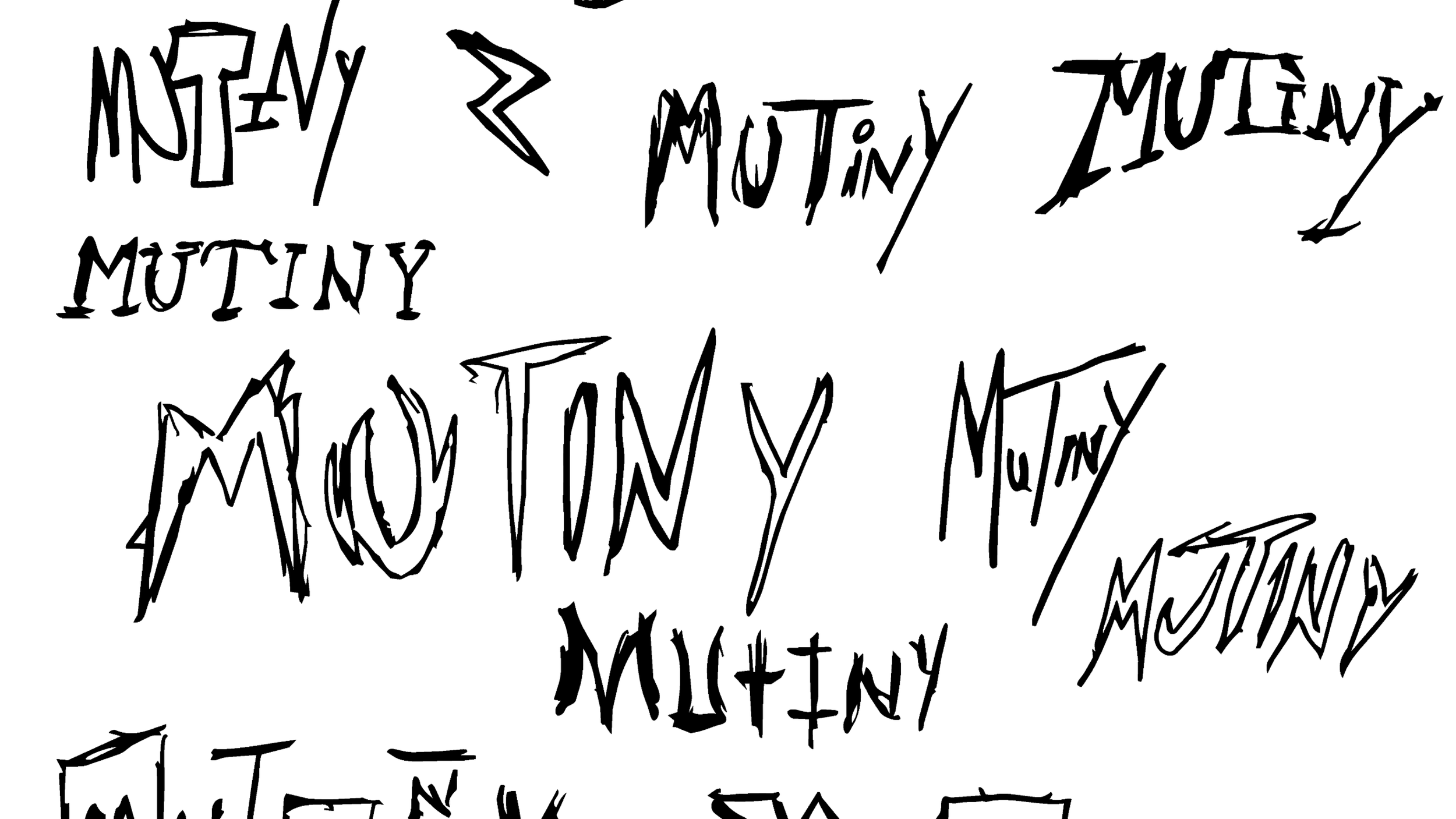
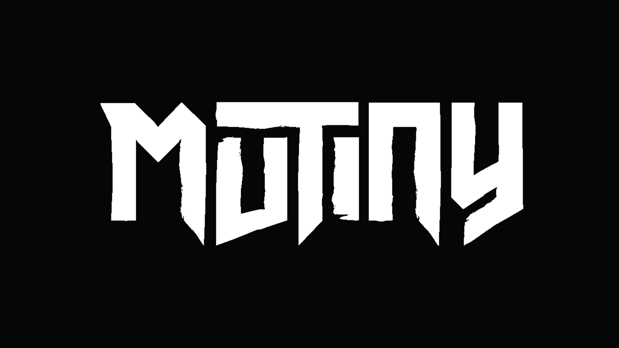
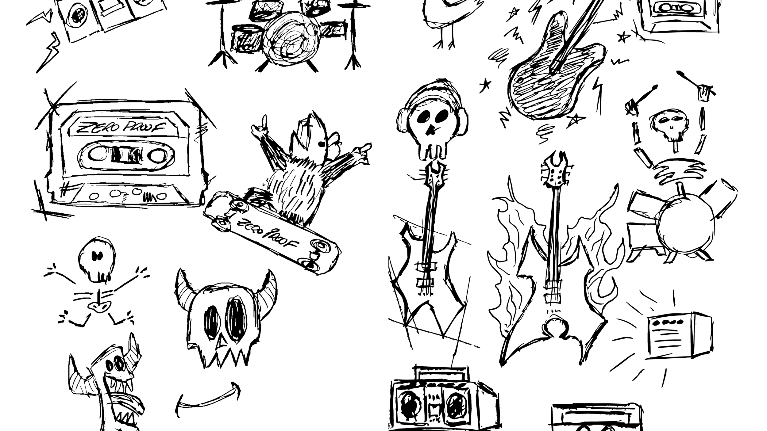
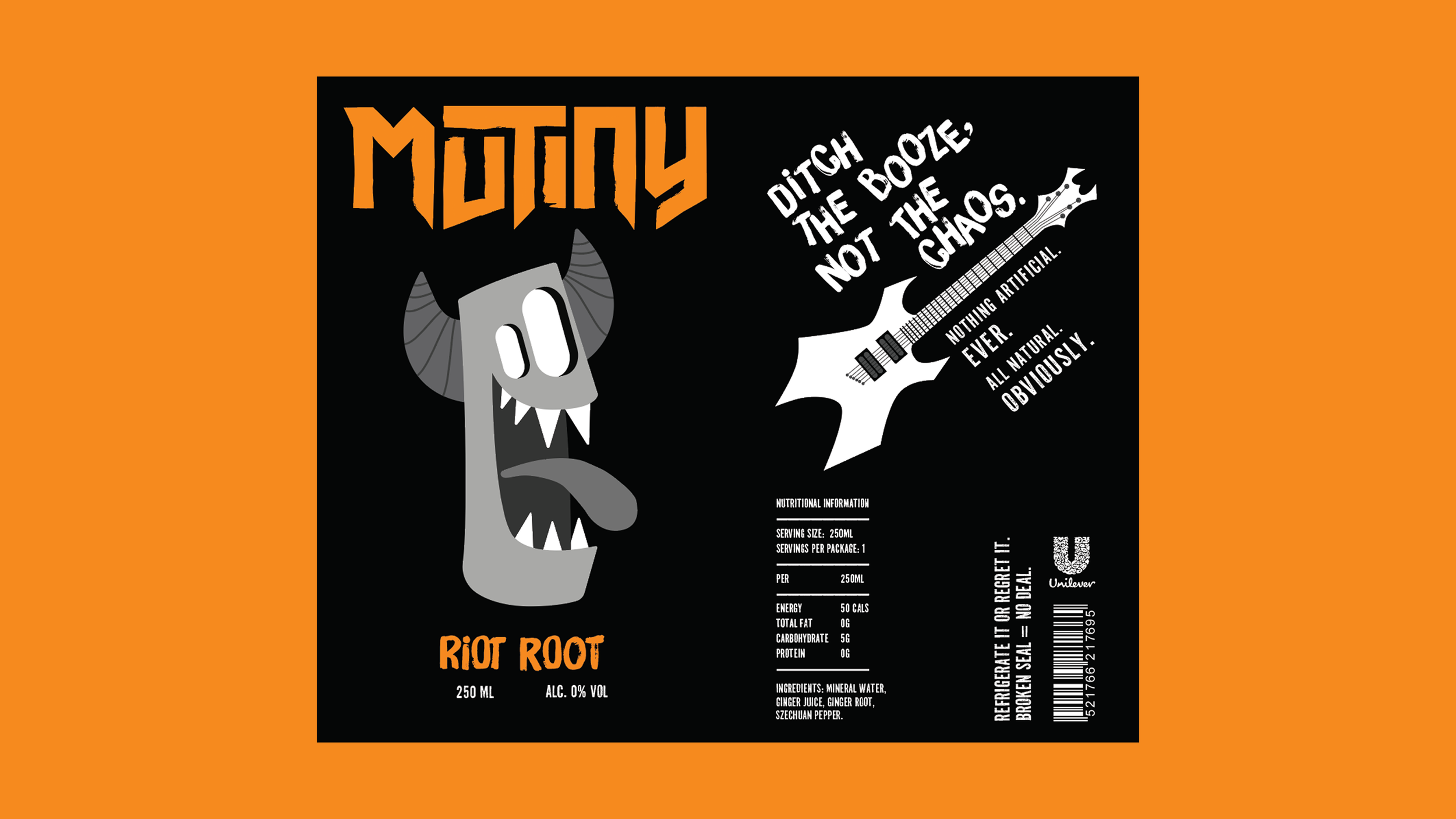
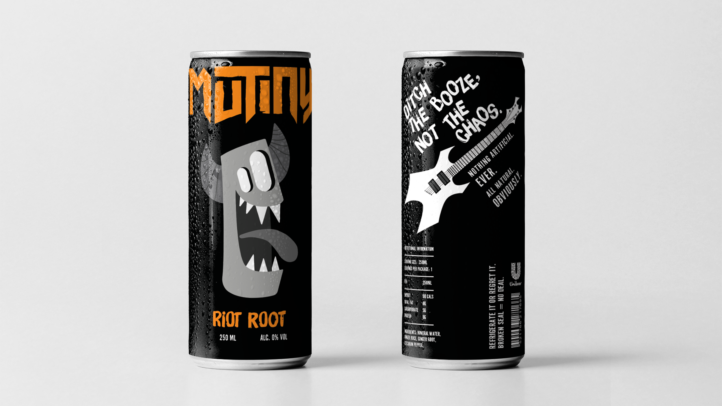
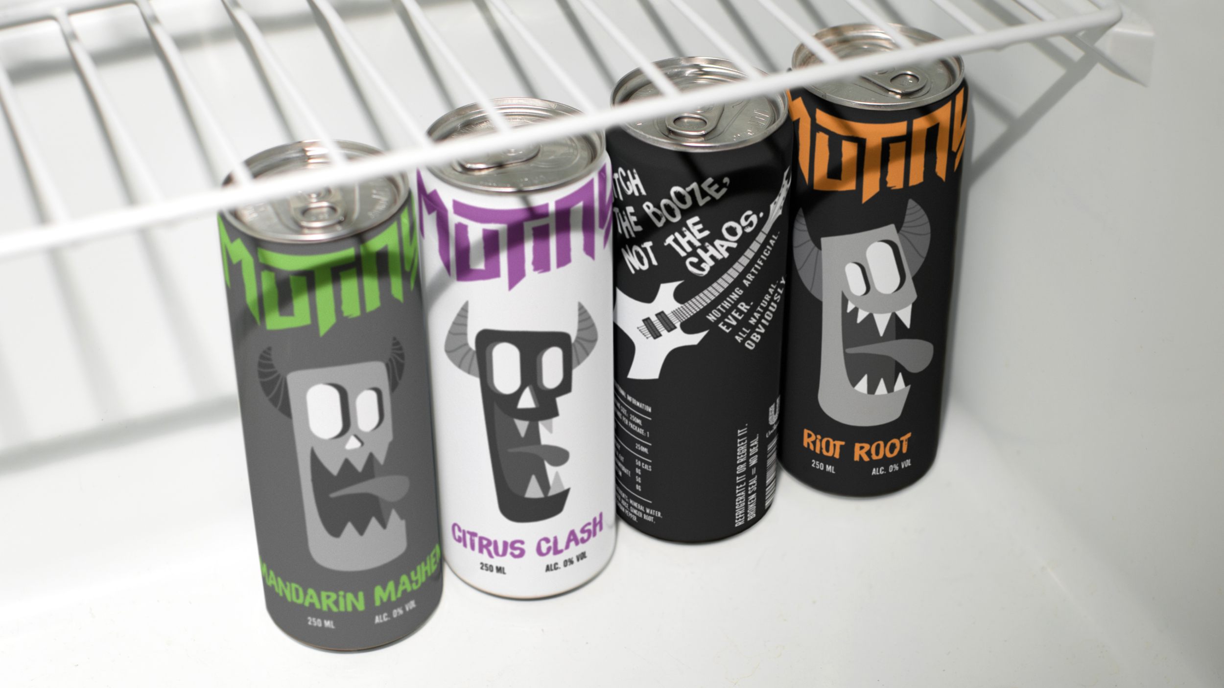
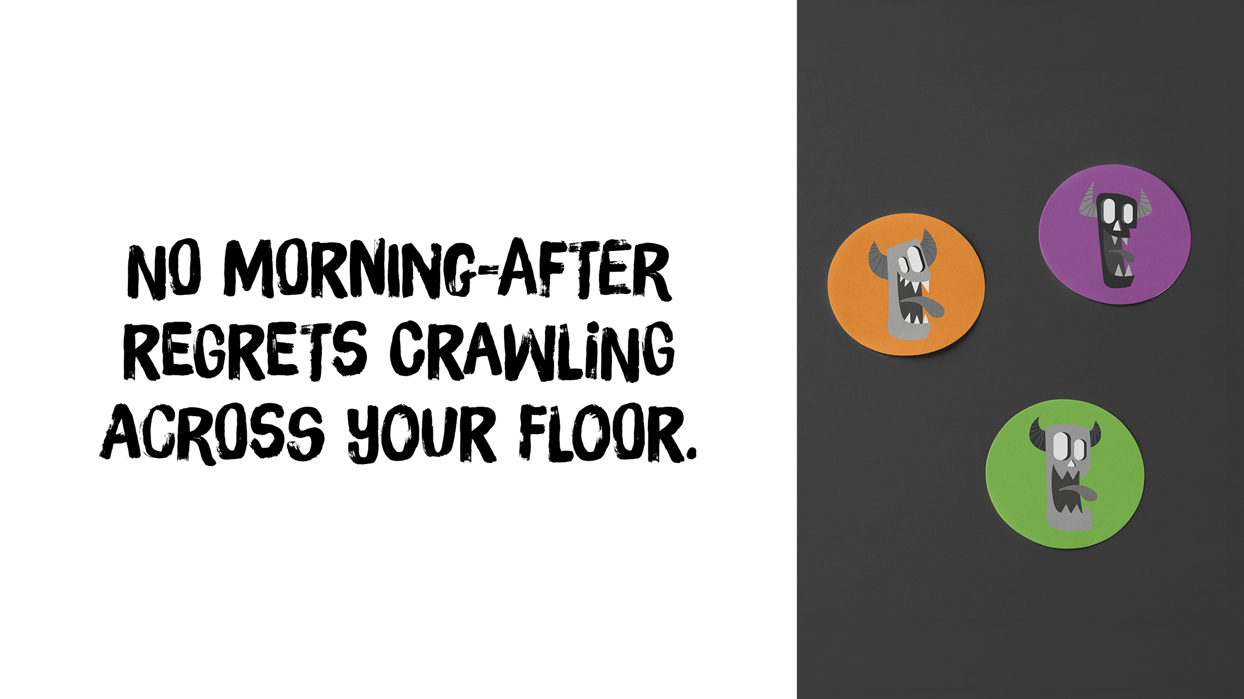
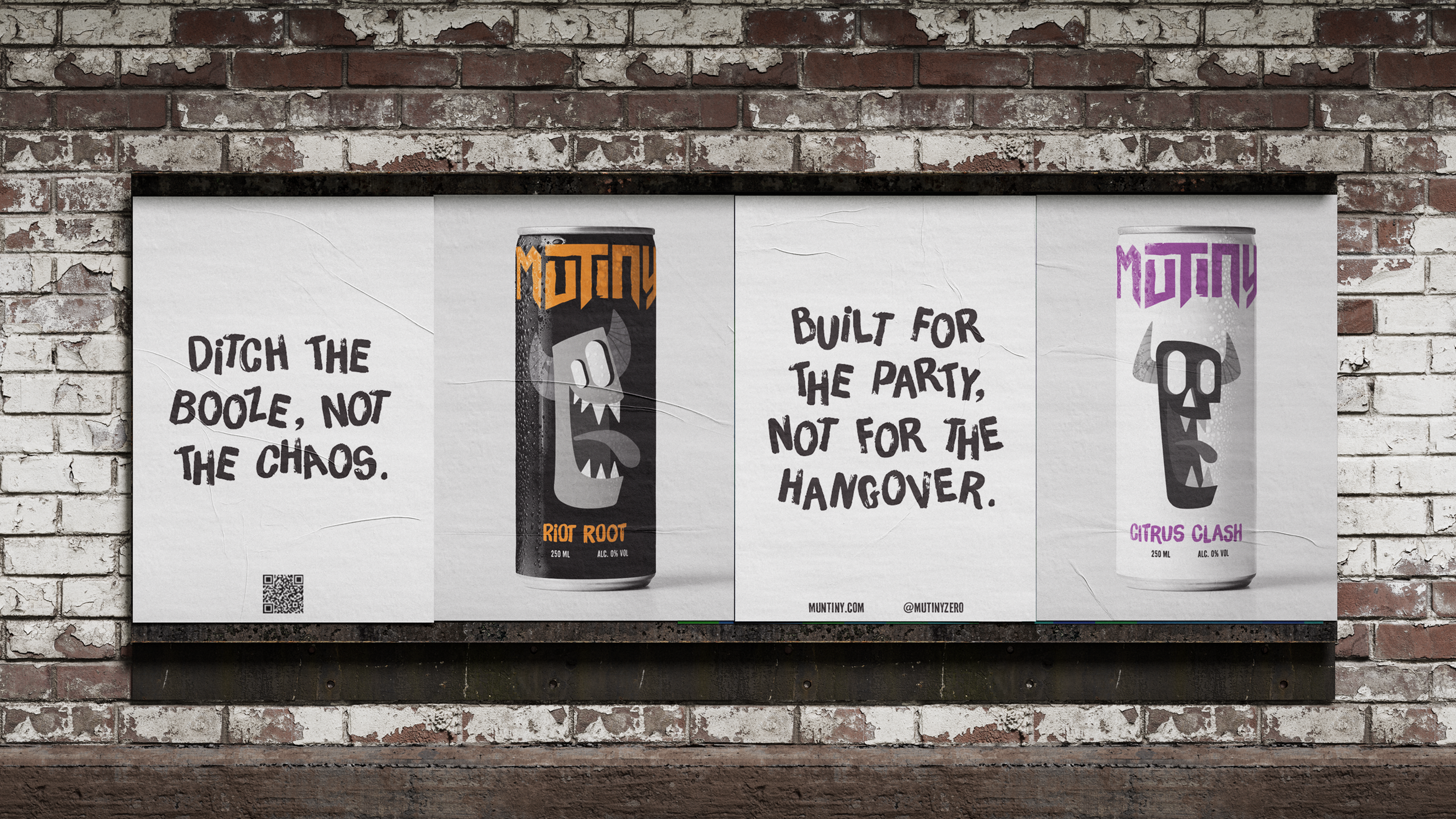
To bring their vision to life, I created Mutiny, a zero-proof beverage brand built around the concept "Measured Taste, Electric Finish" — where refined structure meets punk disruption. I developed a custom disrupted typeface, punk-inspired illustrative characters, and a bold tone of voice, paired with a black-and-white palette punctuated by a single electric accent color. I extended the identity across packaging, posters, merchandise, and a full website, giving Mutiny the same shelf presence and party-ready swagger as its alcoholic competitors while keeping its drinkers exactly where they want to be: in the middle of the fun.